When a person looks at a photo, he (or she) can almost immediately say whether he likes it or not. In rare cases it can take a while, but eventually you can either like the photo, not like it, or stay indifferent to it.
But have you ever tried to ask yourself exactly why do you like or don’t like the photograph? It is much more difficult to pinpoint the reasons for which you feel about the photo the way you do.
In this post I am going to present three photos that I made during one of my visits to Prague, and try to explain why I like them. It will be a good exercise for me, and also a good experience for you, my readers. You might agree with my observations, or might not, but in any case I hope to help you to be more conscious not only when looking at images, but also when creating them.
Click on the photo to enlarge.
I like the photo above for several reasons. Main reason being that it creates a winter-cold feeling, and gets me in the wintery mood. How it does that? Well, first of all the B&W helps – it emphasizes the lack of colors on a typical overcast winter day. The lonely figure also adds to the mood. Imagine for a moment that instead of lonely figure there would be bunch of kids playing with snowballs – would that add to the mood that I’m talking about? Of course not. Considering everything else in the photograph would remain the same, they would create a contradiction by adding playful joy and “bright colors” into pale surroundings. This is why lonely figure is much more appropriate for this photo’s aim. What else? The bare trees and the snow on the ground of course. In addition there is also a three-dimensional feeling to this photo created by the narrow gate at the front leading the eye to the stairs and further on into the photo – different planes create a feeling of space, and the small human figure looks even lonelier in this space.
Click on the photo to enlarge.
Here is another photo of a snowy winter day, and also with a lonely human figure 🙂 What can I say, these photos were taken in the winter, it was cold and I was in THAT mood. I didn’t convert this photo to black and white because I didn’t feel that it was needed. On the contrary, I wanted the snow on the wall to be distinguishable, and the wall being colored helped that. There are several rhythms in this photo – the rhythm of the street lights, the rhythm of the columns on the wall, and the rhythm of the stairs, all creating a sense of harmony. The human figure has strong visual connection with the statue and the viewer’s eye travels between the two. This connection also prompts us to “humanize” the statue, to think of it as if it was a human figure standing there. These two figures are located in the frame in a way that creates compositional balance. The statue in front “tilts” the balance to the left, but the human figure “counterweights” it by being in the center. The statue is bigger, but because it has snow on it, it is brighter, and bright colored objects are perceived as light by the human eye, while human figure is smaller but it is much darker and thus perceived as “heavier”.
Click on the photo to enlarge.
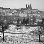
This last photo is my favorite. By the way, it almost didn’t need the conversion to B&W – the colors were missing from the world that day…
The arched walking path and the bare trees standing on its sideways create a sense of swirling motion around the city buildings with St. Vitus Cathedral rising in the middle and being steady as a rock. The horizontal lines in the middle background also add to the motion feel. It is almost a scene from fairytale with a mystical castle and enchanted trees.
Actually, besides what I wrote in the paragraph above, I find it hard to explain why this photo has such a strong impact on me, and maybe you can help me out here. How do you feel about the photos presented in this post, and this last photo in particular? And more importantly why do you feel that way?


